Templates & Tools (Downloads)
Make Delivery Predictable (For Real)
For years I’ve sat in sprint reviews where the numbers didn’t match the story. Stakeholders wanted predictability; teams wanted space to improve. Our project tracking reporting system is abysmal with only paid for customizations. That’s why I built this Sprint Metrics Dashboard after too many “Why wasn’t this predictable?” conversations. It’s the setup I use with real teams to keep data honest and the story clear:
Here’s how I use it with real teams:
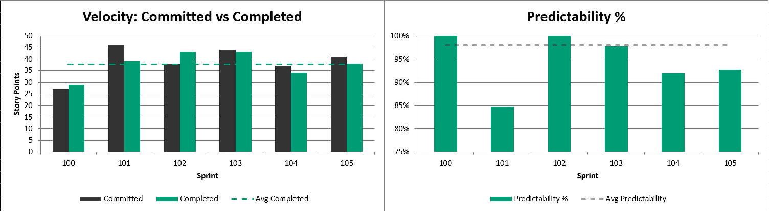
Velocity: committed vs. completed with a clean average line so scope creep isn’t hiding in the bars.
Predictability: easy-to-read bars per sprint + an average line (chart capped at 100% so we don’t distort).
Quality: defects open vs. closed with a steady Team Health reference so we don’t chase numbers at the expense of people.
My workflow each sprint:
- Update the last 6 sprints on Sprint Data (dates, committed, completed, defects, team health).
- Scan Predictability for drift. Ask: “What changed?”
- Use Notes to capture 1–2 retro prompts tied to the charts.
- Share a one-slide snapshot so leadership hears the same story the team is living.
If you’re a Scrum Master or Project Leader who wants fewer debates and more decisions, give my Sprint Metrics Dashboard a try:
👉 Download (free): Sprint Metrics Dashboard
✨ I am also working on an enhanced Dashboard to incorporate more metrics. Get early access here: Enhanced Sprint Metrics Dashboard
#scrum #agile #metrics #delivery #projectmanagement #scrummaster